
Lucy Armsby
G324 Advanced Portfolio
Candidate number: 8437
Other members of my group:
Kathryn Marshall
Annabelle Manning
Felicity Challender
Creating the Digipak
14.01.2015 - 08.02.2015
To create the digipak we had to come up with a set of pictures which represented the genre of music as well as looking professional and of good quality. During a double lesson we broke off into pairs with Annabelle and Kathryn firstly starting to come up with ideas and then myself and Felicity coming up with more ideas. During the time when one pair was working on the digipak the other pair worked on editing the music video.
Below is a list of ideas from both pairs, showing our initial ideas for the digipak, as well as some which in additional could be used for the magazine advert.
Myself and Felicitys initial ideas:
Inside panel 2:
-
Guitar stationary on floor facing camera
-
Ryans hand on top of guitar to steady it
-
Ryan standing in front of town clock, with guitar in hand
-
Long shot
-
Black and white sepia effect
-
Clock to take up two thirds with Ryan taking up one third
-
Half shot of ryan - Guitar to be held in left hand to appear on right hand side of image
Inside panel that folds out:
-
Mid shot or close up
-
Black and white sepia effect
-
Ryan looking down at acoustic guitar
-
Mid shot or close up
Annabelle and Kathryns ideas:
Front cover:
-
Standing
-
Direct address
-
Long shot
-
White font, thin effect
-
Similar to handwriting font to make it look natural
-
Guitar
-
Use rule of thirds
Back Panel:
-
Text above the bench as if written in the sky (use handwriting font)
-
Long/ mid shot of the beach
Inside panel 1:
-
Artist sitting on the curb
-
Artist looking away
-
Guitar in hand
-
Long/mid shot
CD part:
-
Mid shot
-
Guitar image also on CD
-
Name of artist and album on CD, not on digipak
-
Lonely guitar
Costume:
-
Smart shoes
-
Black skinny jeans
-
Smart shirt
-
Black coat
 |  |
|---|---|
 |  |
 |  |
 |  |
 |  |
 |  |
 |  |
 |  |
 |  |
To the left you can see a gallery of a few of the different photos which were taken over the two days we designated to the photoshoot. One the first day the whole group took pictures with Kathryns professional camera. This meant we could get clear photos which were of good quality, to be able to use for our professional digipak. As you can see from the photos we decided to stick to areas around the sixth form such as the Howdale and the town centre. We mainly decided on this because of the limited time which we had. Some of the shots include Ryan sitting on a wall, holding the guitar, looking off into the distance, meaning we took into consideration everyones ideas. Kathryn took a leading role in taking the pictures, because it was her camera, however everyone did have a go at taking some at some point. On the second photoshoot day only Annabelle and Kathryn went to take pictures whilst myself and Felicity stayed to edit some of the footage we had already gathered. Overall I think the photos look very professional, and we are very grateful as a group for Ryans help.
Editing:
When it came to the editing process we all worked as a group deciding how we wanted the images on the digipak to look. We decided that we either wanted a black and white effect or a sepia effect on the photos to make them look more fitting towards the genre. One of the main difficulties we found when editing the images was making them the same size, meaning they could fit within the digipak measurements. Myself and felicity decided on resizing the photos, however this made some of the ones where Ryan is standing up and some of the ones where he is leaning against items look a bit off, and making ryan look very skinny. In the end we decided that cropping the photos would be best, meaning that the size of the photo would not be altered, even though this does mean some of the photo is lost. To the right you can see a selection of photos showing how different ideas when it came to editing.


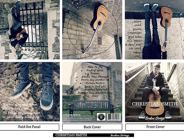
To the left you can see the 3 different mock ups we made using our own photos for our digpak, working as a group we came up with 3 looking at the different photos which we felt would work best for the digipak. Annabelle and Kathryn put the song titles on the back of the digipak using a similar handwriting font, which we felt was a typical convention of the genre, and went well with the tone of the songs and the pictures, they also included the barcode and other legal requirements onto the digipak to help make it look professional. Within the 3 different mock ups we used a different filter for each and a different selection of photos, ready for our audience feedback which we are just about to get. Personally I felt that all of them looked very professional and could see them sitting on a shelf in the shops.
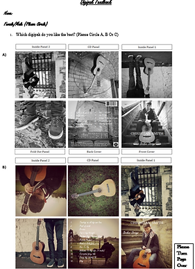

To the sides you can see an example of the questionnaires we sent to different people around the sixth form to find out thier views about the digipak. Annabelle took this role upon herself to take these around the sixth form gathering information about what people thought about the digipaks. Some of the questions included, Why do you like this digipak? What makes it appealing to you? What genre do you think this digipak is aimed at? and If there was one thing you would change, what would that be?. These questions allowed us to get the most in depth information possible to make our digipak the best.
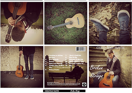
The final digipak
Above is our finalised digipak showing all the changes we made from taking into consideration our audience feedback. From looking at the audience feedback we saw that people liked the:
-
Professional look
-
The genre suiting filters, colours and fonts which were used such as the handwriting effect font, and the white colour which is used in many other acoustic artists such as George Ezra.
-
The emphasise on the guitar and Ryan himself, giving the digipak a personal feel linking with the genre.
-
A good colour scheme - faded saturation
-
They liked the look of the lyrics on the back, and the position in which they were placed.
-
They also thought the images were of a good standard and were very clear in quality.
Some areas which they felt could be improved were:
-
The CD circle, making it fit better, not cutting any wanted elements out of the picture.
Some people thought the font on the back of the CD was not clear enough, so this was something which was worked on.
We also found that people were willing to pay around £5-10, similar to the price of most CD's which are in shops such as HMV, and websites like Itunes. The lowest price some people would pay was £2.99, however looking at our genre we found that this was to lower price to pay.
When it came to editing the final digipak, annabelle took a leading role, taking into consideration the audience feedback results. Overall I think our final digipak looks very professional and really brings to life the song which we are making our music video for. Kathryn changed the font on the back to make it more clearer.